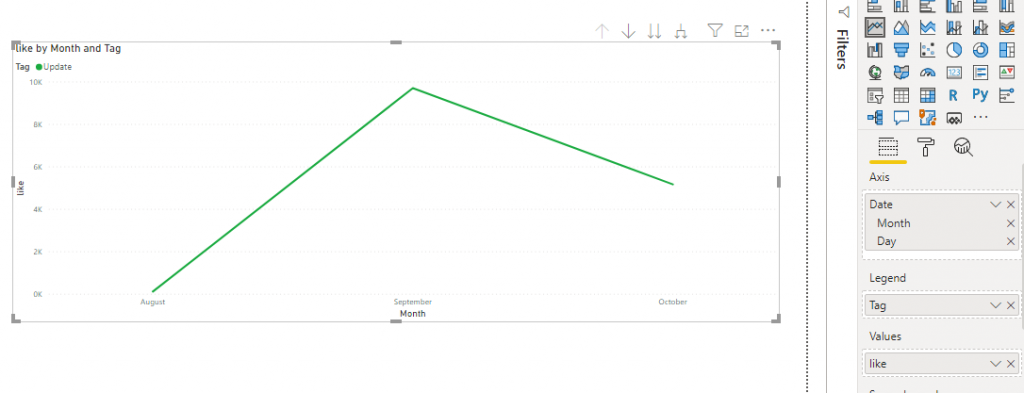
The problem that I deal with Date is – when I put the date in series(inside Table or Chart axis) , it doesn’t show up day by day. It’s grouping into months or it’s showing only one month data like below chart.
I’ve no idea what’s happening. When I search google , there’s several discussions about ‘Calendar/Date Table’. I’ve follow their ways to build up separated Date Table , link with main data , but nothing happen.
Here’s the list of links I’ve to read about ‘Calendar/Date Table’-
1. https://exceleratorbi.com.au/power-pivot-calendar-tables/
But, the solution was fucking easy. That’s because of Microsoft . In update features , Microsoft added Date hierarchy by themselves instead the user create another Date table , reduce the user’s effort. But it makes the beginners(like me) to be confused.
The solution is – to click the DOWN arrow from the Date in Axis (in my example), then change hierachy into the normal Date. Then it’ll solve the problem and will give day series output.
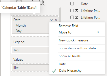
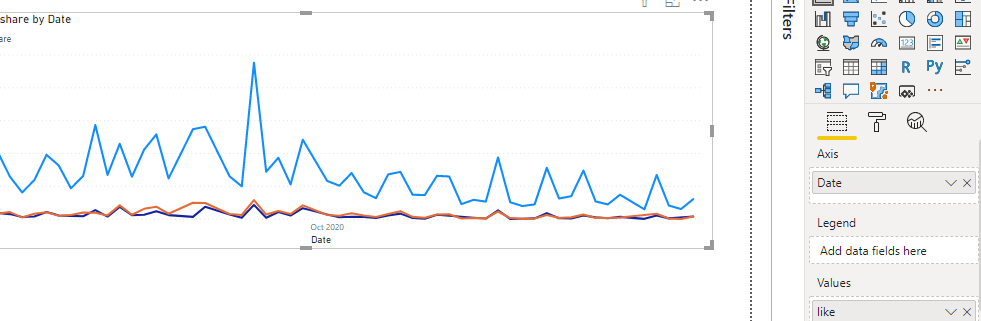
Result for changing from Date Hierarchy to Date :
Hope this note will also help you if you face the same error like I did.
You must be logged in to post a comment.